Coutts
The Brief
Coutts noticed that the majority of their customers used phone banking to do even the most menial of tasks. They wanted to reduce the number of calls by improving the experience of their online banking tool, hoping to increase regular adoption.
Site Map and User Journeys
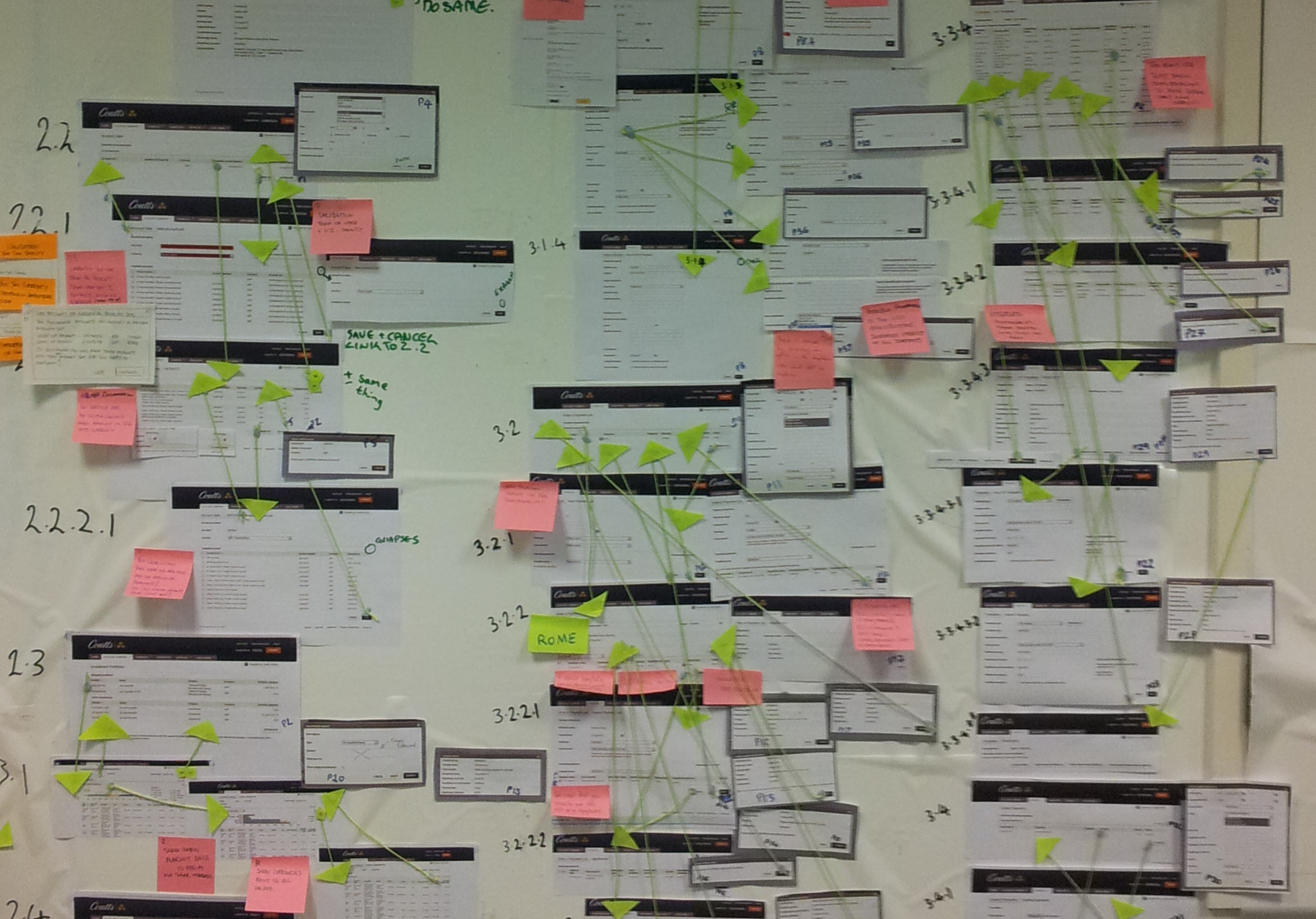
The first task I did was to make a sitemap to understand the information architecture of the site. This soon proved to be easier said than done. Due to the amount of pages and permutations I soon realised that creating this in Visio would be a nightmare to navigate, so I came up with a better way to show the full sitemap...
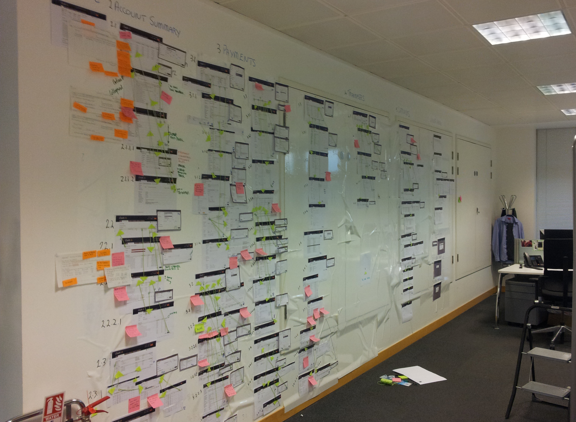
Each page was printed out, along with all possible modals. By using string and green arrows I could then show where every CTA would take the user to.
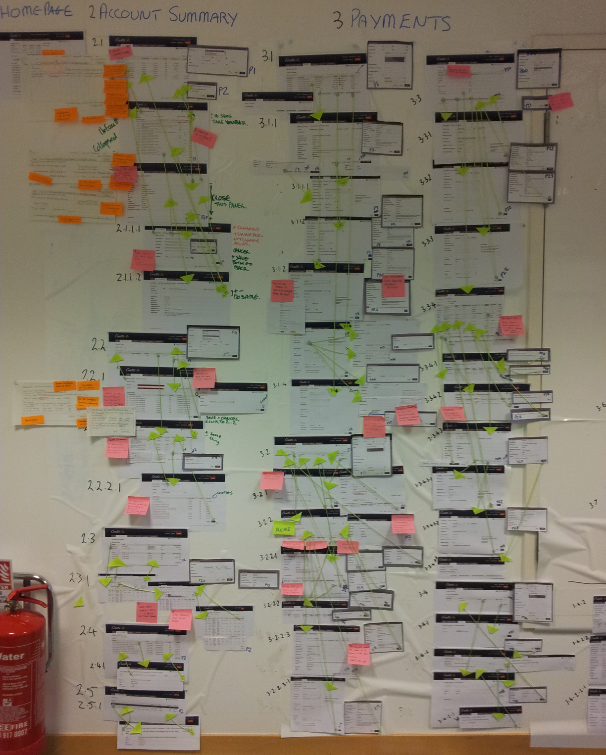
It soon became apparent that any user trying to perform simple tasks on this site would have difficulty in doing so as CTAs would often take users to unexpected places. In some cases a majority of CTAs within an area would always take the user to the same page for no reason.
Solving The Problem
After showing the client the existing problems they asked us to proceed with suggesting functional and design changes to make the website easier to use for everyone.
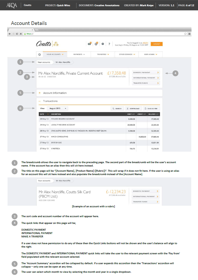
Coutts used a third party development company, and so to ensure all the changes were done correctly I provided them with annotated notes for each design/functionality change