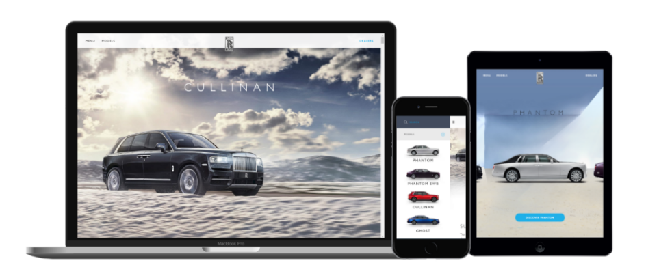
Rolls Royce
The Brief
I was brought in late to this project to fix a lot of underlying problems on a design that had already been worked on for a couple of months and was not deemed to be suitable by the client.
I was tasked with:- imposing some sensible hiearchy to the information on each page
- improving the way in which a user could select between car models (even if they didn't know the model names)
- ensuring key metrics such as dealership appointment bookings were met
- prioritising requirements for the development team now that everything was behind schedule
Fixing The Page Structure
Looking at what they already had it was clear that the page structure wasn't clear and it was difficult for users to switch between models. This is one of the first problems I looked at solving.
I grouped all of the existing information/pages into categories and went about creating a page structure to ensure that all of the existing material would have a space to live on the proposed new layout.
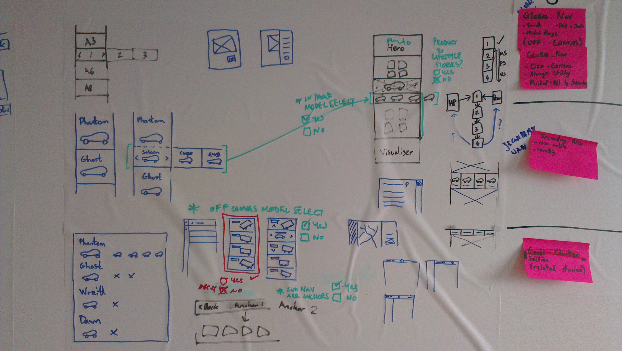
Helping Users Identify The Models
As a lot of users don't know the model names when they come to the site, it raised a question about how to help users navigate to the correct model that they're looking for. Simply putting the model names in the navigation wouldn't work. Having a full-width car selector at the top of the homepage to direct users to the right place would also prevent the client running campaigns and features above the fold on their homepage without moving the car selector.
The solution: to show the outline of each model side-on. This is the easiest way for a user to differentiate between each model. So I created this off-canvas menu to contain these images accompanied by each model name.The Model Selector
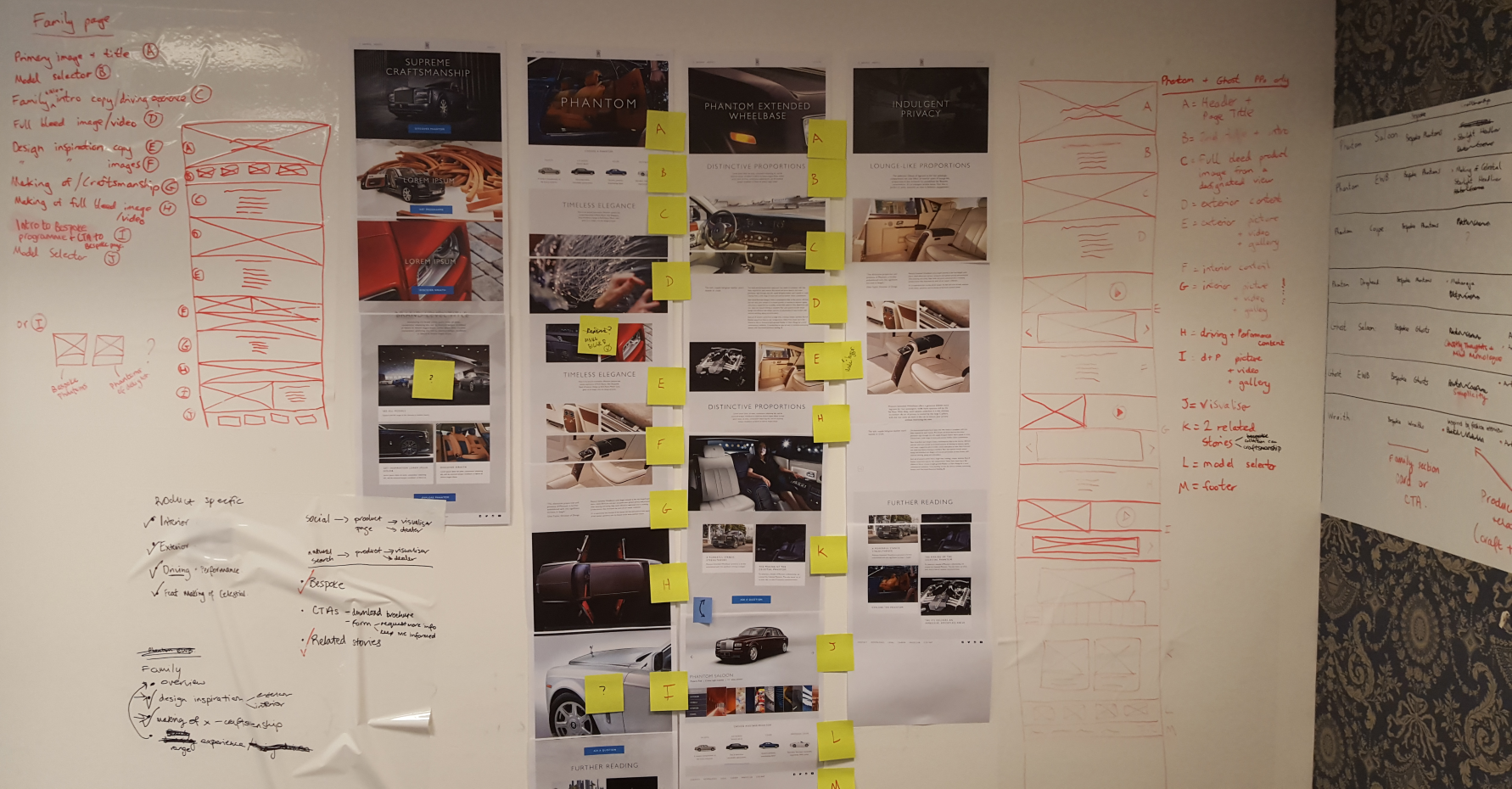
Ensure Key Metrics Were Met
Due to the nature of the content on the pages being quite long to tell the story of each model it was key that the enquiring about a model or finding a dealership wasn't a distraction and could be actioned from anywhere on the page. On a lot of car websites the key CTAs are at the bottom of the page, and sometimes these take you to another page or open a modal. This would not work here.
The first solution: to place multiple CTAs on the page that would bring in a panel onto the page from the side wherever they are on the page, so it would not interrupt their vertical progress through the page/story.The Request Contact Panel
The second solution: by having a sticky header the 'Dealers' CTA could always be visible. This too would be an off-canvas panel. Within this panel they can do a search and then even click on a result without leaving the panel to see more details about the dealership