HRG Travel App
The Brief
HRG needed a travel itinerary app to meet customer demand and ensure they wouldn't get left behind by competitors who already had apps available for customers. I was tasked with designing the app and also creating the first development team in our London office - this meant interviewing and recruiting mobile app developers and managing them on a day to day basis.
The First Release
Due to contract commitments with multiple clients we needed to be fast to market. The first release was released to both app stores within 4 months of recruiting the team - including creating all necessary APIs, databases and configuring push notification services on both Android and iOS.
Once the app was released we gathered feedback from end users which helped us prioritise potential new features on the backlog and also which functionality needed tweaking and perfecting.
Improvements
Here's some of the thinking that went behind just a few of the many improvements that went into the next major release of the app 4 months later.
"How could a user switch between travel segments more easily?"
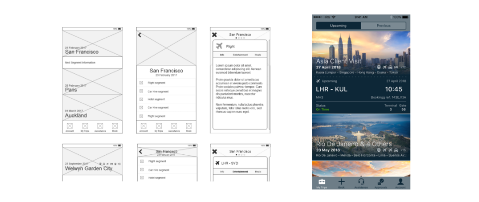
The ProblemThe first release of the app used a hub and spoke navigation for each trip - meaning that to navigate between consecutive segments ('spokes') on a trip the user would have to
traverse up a level back to the the trip page (the 'hub') to be able to select the next or previous segment.
Implemented Solution
To improve this I introduced a carousel at the segment level - meaning
within the same trip a user could swipe sideways to view the previous or next segment.
To help ensure users understood this concept a few items were incorporated into the design to try and ensure they could disover this functionality;
- Each segment within the trip was given a dot as a carousel indicator. This is displayed at the top of the page - and the segment currently being displayed is highlighted.
- The number of segments is also shown to the right of the title, and the number of the segment currently being shown is shown above that.
- The segment is shown on a card, and edges of the previous and next cards (if applicable) are shown on the screen too - helping hint that they can swipe to access these other cards.
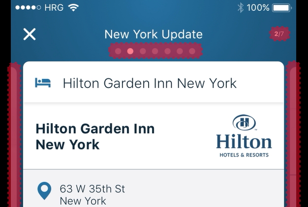
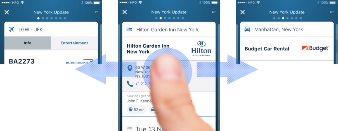
"How could a company provide helpful information to their travellers during a trip that was both contextual and relevant to where they were?"
The ProblemOne thing a lot of clients found was that when users were travelling they often ignored travel policies, so they wanted to update users about policies and recommendations/advice whilst they were on the trip. Users would ignore emails and didn't have a desire to read perceived 'help documents' before or during their trip.
Implemented SolutionI came up with the idea of embedding the relevant information within the user's trip but as a card before or after the relevant travel segment. So as an example any information
relevant once a user has landed at an airport would be shown on a card after their flight segment.
A notification would be sent when their flight landed remdinding them of this information, and simply by tapping on this they'd be taken to the relevant
card in the trip showing all the useful information they needed (e.g. phone numbers, addresses..)
"How could similar trips be differentiated more effectively in the app to help users tell them apart?"
The ProblemTravellers who do similar trips or do multi-leg trips and do not name their trips when booking them have them automatically named after the first 'destination' in their itinerary. Only 1 city is ever used in the name, and often it is not correct.
Implemented SolutionI came up with the idea to introduce some destination logic that used Google to map each segment to the correct city or town, and then each place visited would be included in the name. If only 2 cities were visited then these would appear as the trip name, and if 3 or more cities were visited then the trip name would say "[Destination] & [#] Others" - and in each case all of the cities visited would be listed beneath.
When viewing the Trip Details page the top header would scroll through the relevant city images for all cities visited within that trip - this helped the user see more images related to their trip rather than being shown just the first one. On the Trips page the city images for each trip would not animate as this could disorientate a user - by using the first city image each time it would help them find each trip using recall by just glancing at the images.
"How could we help users get from each leg of their journey to the next in a more seamless way?
The ProblemTravellers often didn't look at how to get from the airport to their hotel until they were in Flight Arrivals and were already heading straight to the taxi rank. Equally users wouldn't look at how to get between other segments like hotels and train stations, they'd simply book a taxi and charge it back to their employer. The problem was not just the cost to companies, but that in some cases it was actually quicker for employees to use other forms of transport.
Implemented SolutionI looked into how we could use a Google API to surface to the user different methods of transport to get them to their next travel segment, clearly showing the time each method would take. If walking took longer than 15mins then this was excluded from the methods shown. If a user wanted to take any of these transport methods they could simoply tap on the relevant icon to be shown it on their preferred map app. In the future the intention was to plug in company preferred taxi providers so that they could book taxis from here without even having to enter the pick-up or drop-off locations